
I collaborated with The Dutch Design Agency—one of the leading creative studios in the Netherlands—on branding and digital design for a Holland-based company specializing in microdose mushroom-infused water. With the growing market around legalized psychedelics, the goal was to create a brand identity that felt clean, forward-thinking, and trustworthy, while reflecting the wellness-driven, conscious lifestyle of its audience.
My role spanned brand development, social media content strategy, and UX/UI design for the website. We crafted a minimal yet vibrant visual system that positioned the product as both innovative and approachable, blending wellness culture with European design sensibilities.
Project Overview
UX/UI
BRANDING
SOCIAL MEDIA
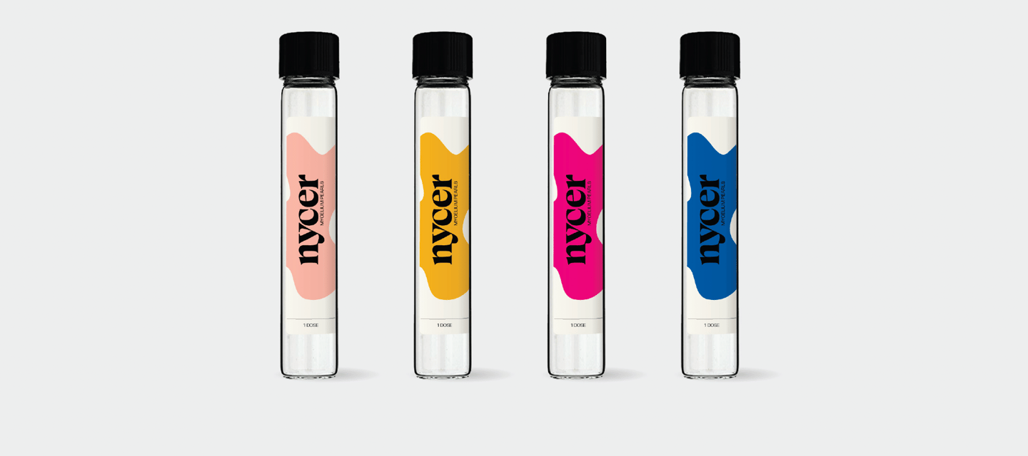
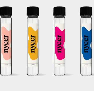
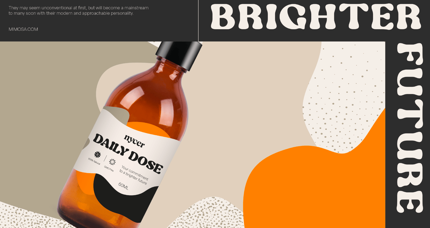
PACKAGE DESIGN
Scope of Work
Timeline
4 Months
UX/UI Development
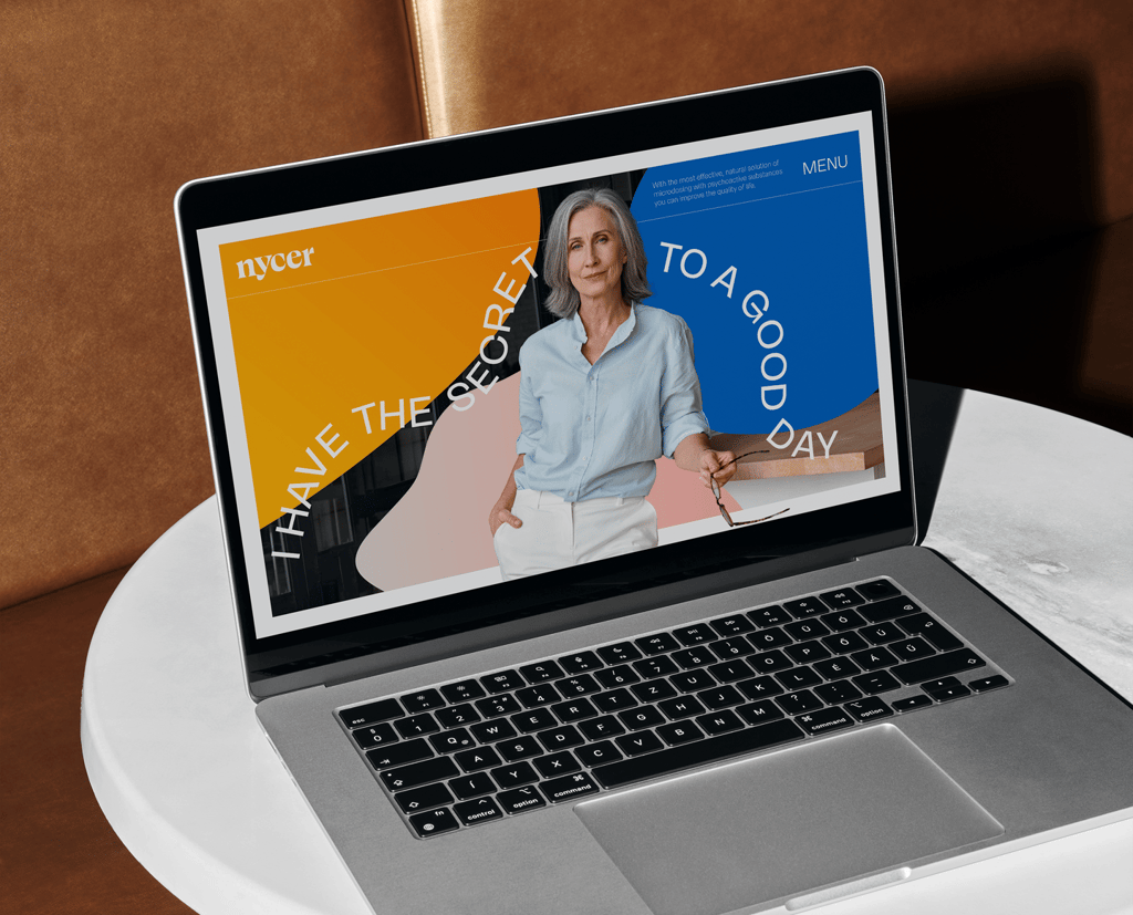
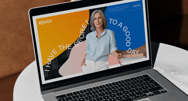
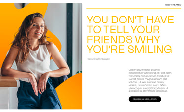
I contributed to the creation of 20+ high-fidelity frames for the brand’s website, focusing on clear visual storytelling and user experience.
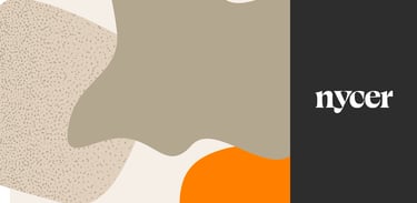
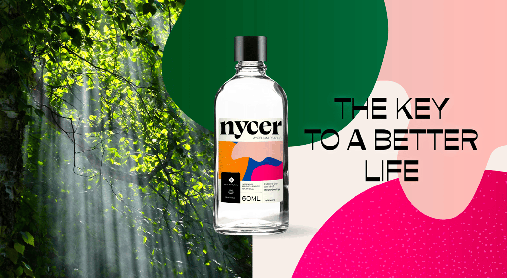
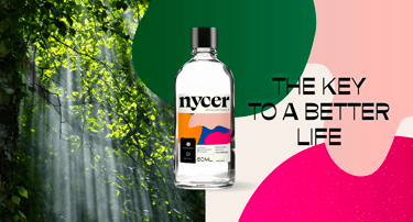
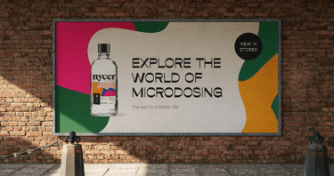
Chosen Branding
I helped design an introductory quiz and key educational pages, supporting the brand’s mission to inform users about microdosing in a thoughtful and engaging way. I reviewed and tested interactive flows, identifying usability issues and reporting them to the team for refinement.
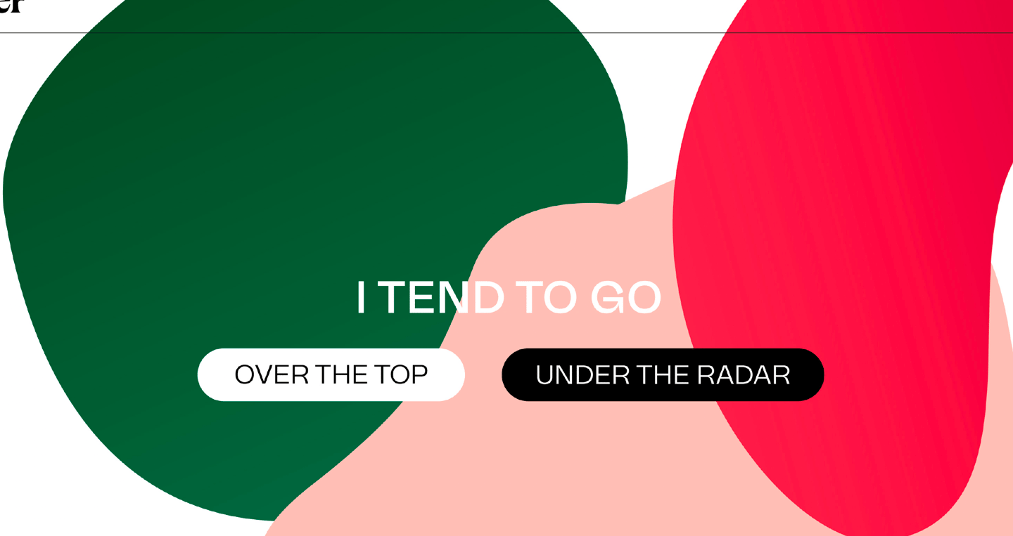
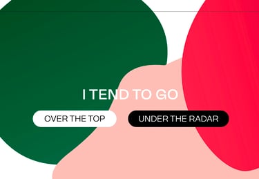
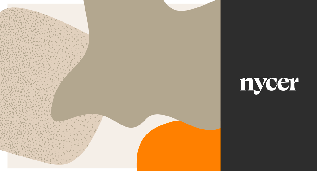
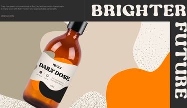
ALTERNATIVE BRANDING: OPTION 2
The second option we explored with
earthier tones.
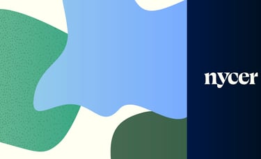
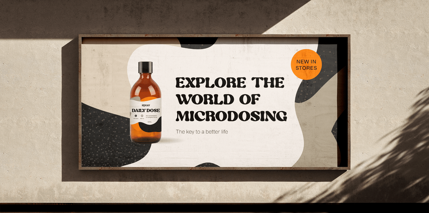
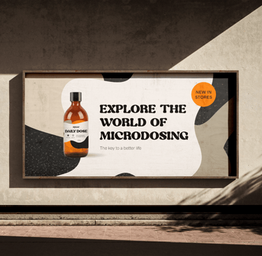
ALTERNATIVE BRANDING: OPTION 3
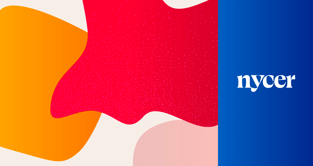

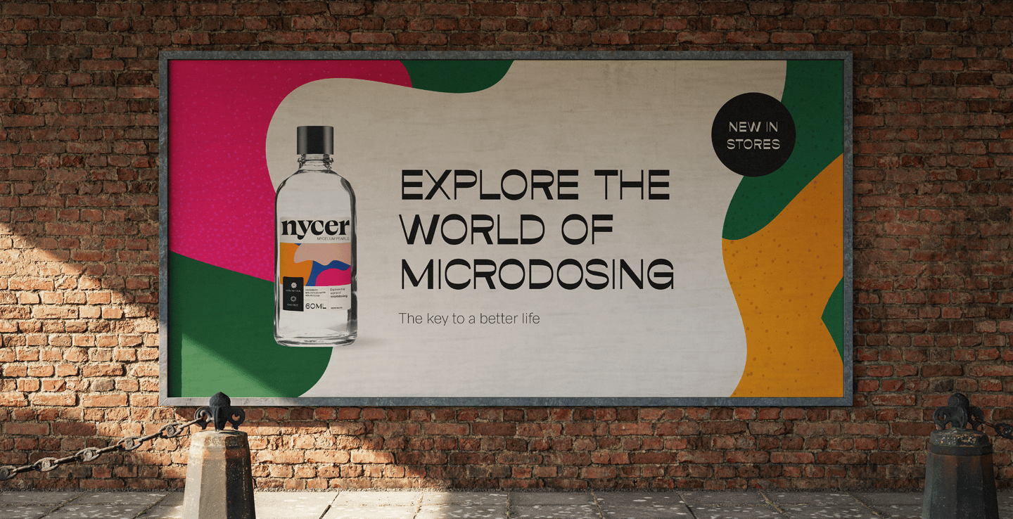
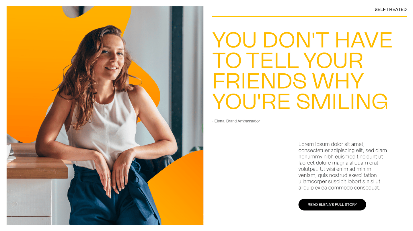
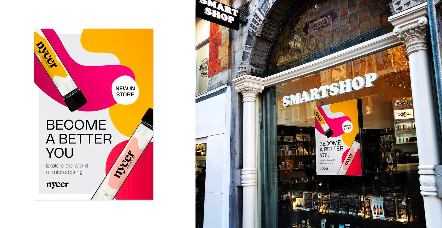
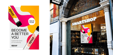
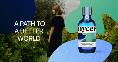
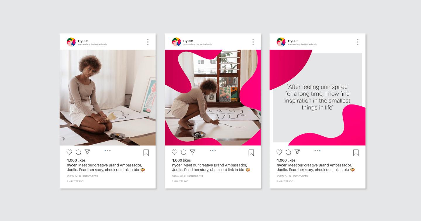
Nycer was born from a simple idea: you’re still you, just a bit nicer. A touch more curious, a little more creative, and open to what the world has to offer. The branding reflects that philosophy: joyful but grounded, playful without losing credibility.
We leaned into more of a vibrant and primary color palette to evoke clarity, optimism, and energy—balanced by cool grays that bring a sense of calm and professionalism. The result is a brand that feels both elevated and accessible: like a good conversation with a friend who makes you think differently.
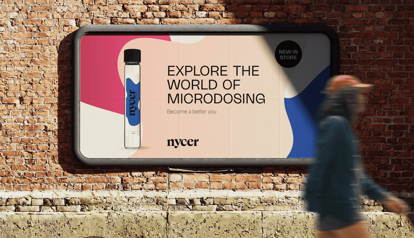
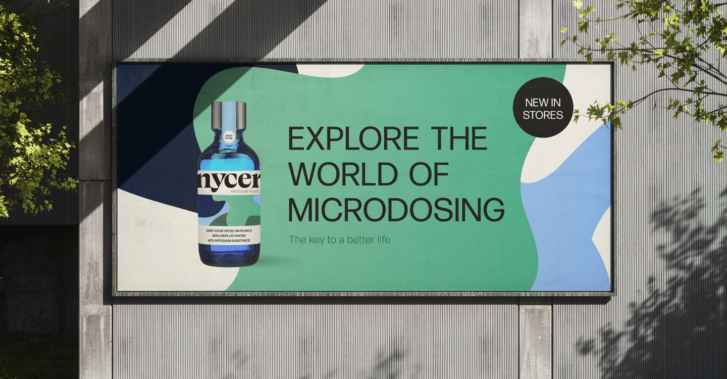
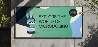
While deciding to pull certain elements from the final exploration of the design direction, we did decide to go with the first for its cleaner, more sophisticated and trustworthy presence.
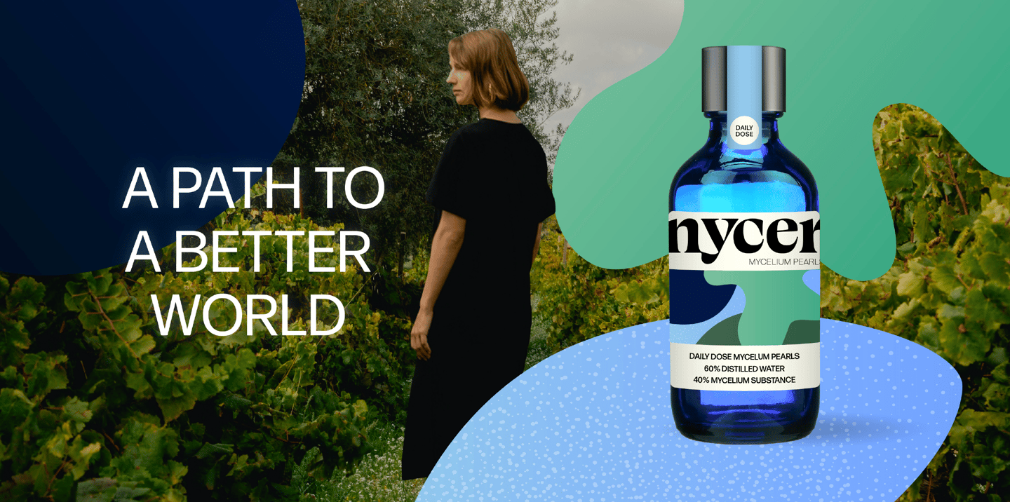
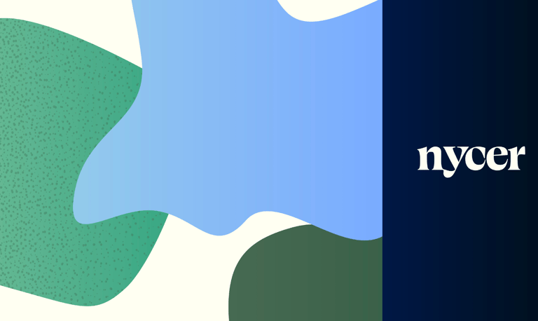
The third option we explored with cooler blues and greens and a different packaging proposal.